Lab 2: Anypoint Monitoring
Overview
Understanding the state of your infrastructure and systems is important for ensuring the reliability and stability of your services. As part of Anypoint Platform, Anypoint Monitoring provides visibility into integrations across your app network. The monitoring tools provide feedback from Mule flows and components in your app network.
In this lab we are going to review Builtin Dashboards and Custom Dashboards. This funtionality can be found in the base subscription. Advanced monitoring capabilities available through the Titanium licensing package are not covered in this lab.
Step 1: Browse Built-in Dashboards
Dashboards in Anypoint Monitoring provide visibility into Mule apps and APIs that are deployed to your environments. In this Step we are going to review Built-in Dashboards.
-
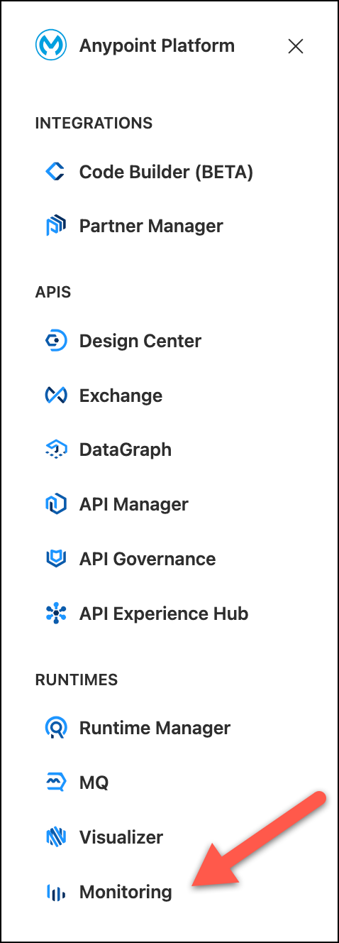
Go to Monitoring
-
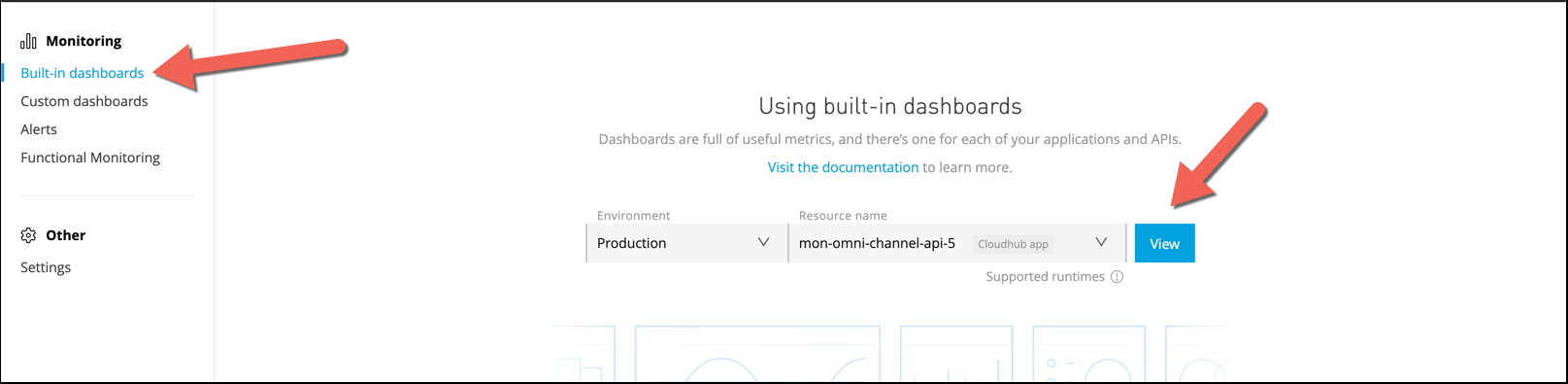
Select Built-in dashboards on the left side.
-
Choose:
-
Environment:
Sandbox -
Resource name:
mon-omni-channel-api-<id>
-
-
Press View
-
You will see an Overview panel with numerous out-of-the-box graphs generated from standard metrics collected by Anypoint Monitoring.
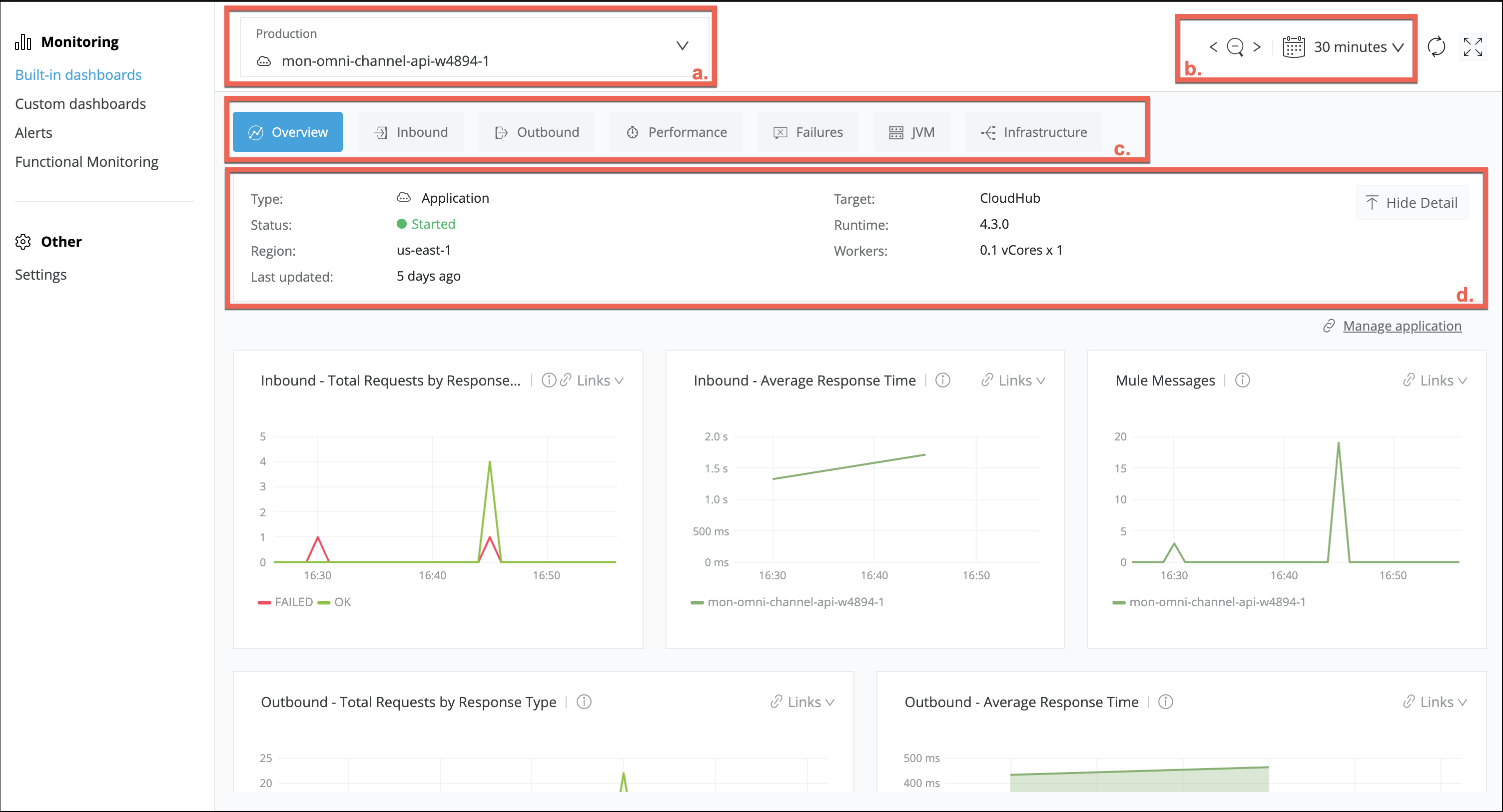
We will describe each section
-
You can see the Environment and the API being monitored.
-
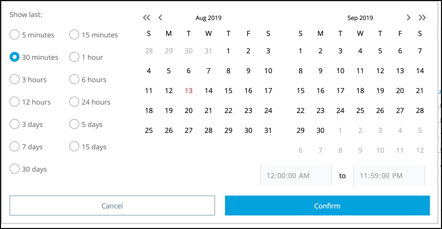
You can filter the report by hours, days, months, period of times.
-
Here you can see different dashboards grouped by
-
Overview
-
Inbound
-
Outbound
-
Performance
-
Failures
-
JVM
-
Infrastructure
-
-
-
Navigate over those items to see the different dashboards.
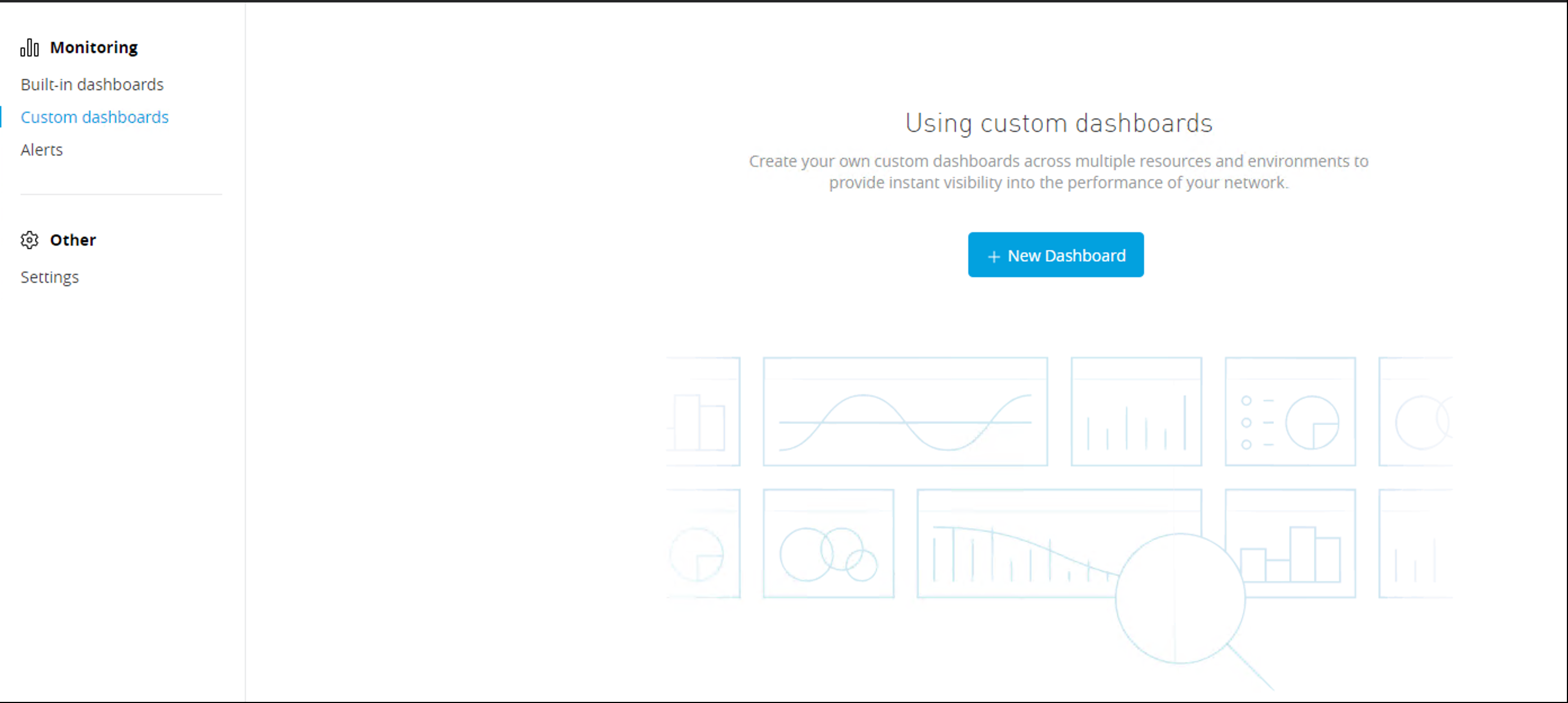
Step 2: Create Custom Dashboard
We’ve already seen the different graphics that comes out of the box. You can see them filtered by application. In this section we will create and customize dashboards with different APIs and Metrics.
You will see that you can retreive metrics from both the Runtime Manager and the API Manager. In this lab we are going to concentrate on Runtime Manager metrics.
-
Go to Monitoring section and then select Custom dashboards.
-
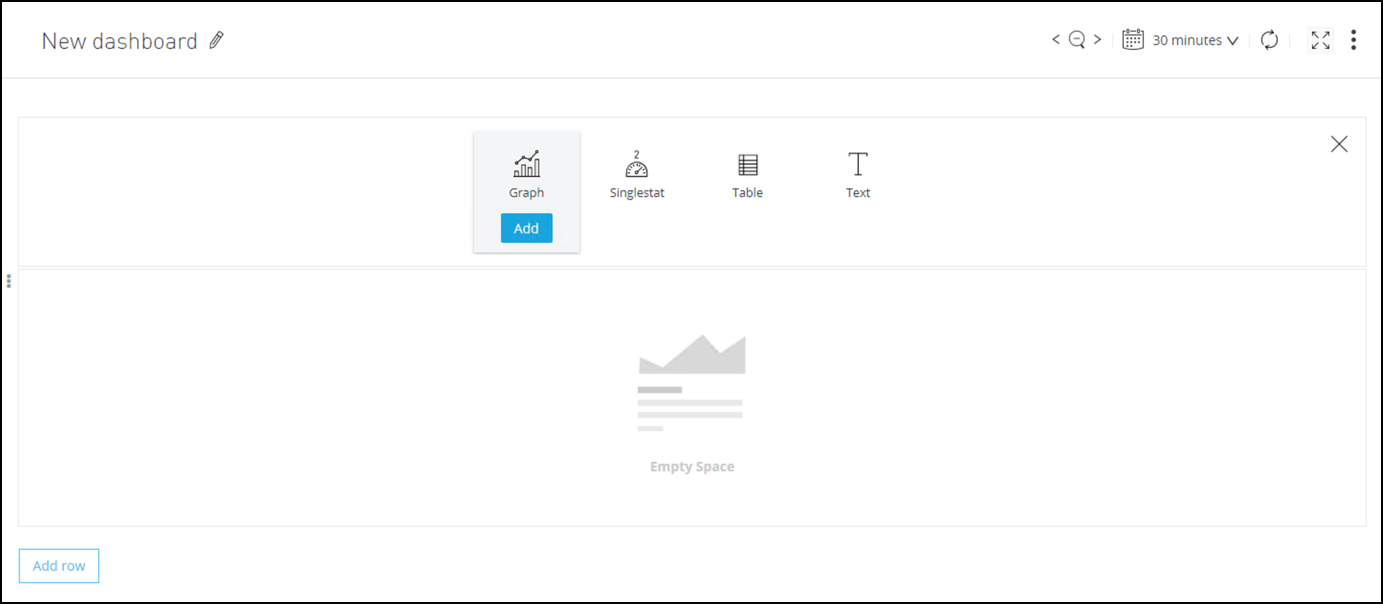
Press the New Dashboard button.
After that you will see a page like this
-
Click on the Pencil icon to edit the dashboard properties.
-
Complete with the following values
Name Value Description Name
<intitials> My Custom DashboardName of the Custom Dashboard.
Description
Custom Dasbhoard for the ALC WorkshopBrief description.
Tags
<initials>-alc-workshopAdd a tag to facilitate searching.
Time Zone
Local browser timePrefered Time Zone
Graph Tooltip
Shared TooltipThis option will show you metrics inside the graphics
-
Press Save Changes button.
-
In the Save As Pannel choose a representative name like
<initials> My Custom Dashboard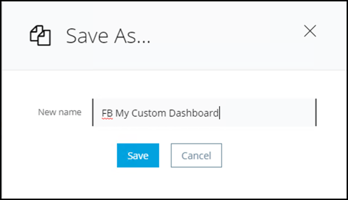
Great, now you can continue to add Graphics and Metrics.
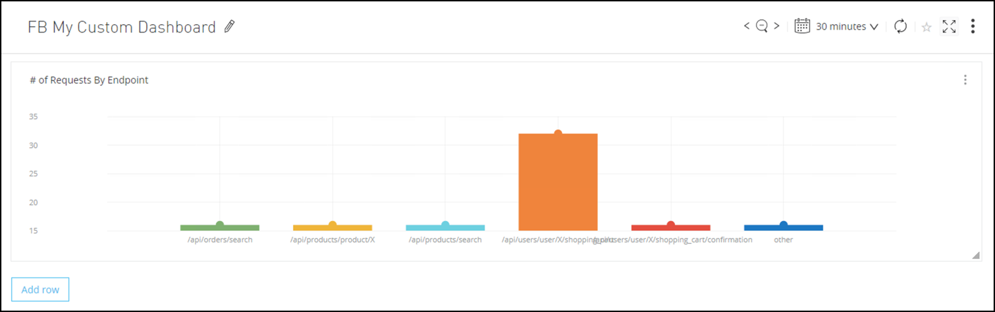
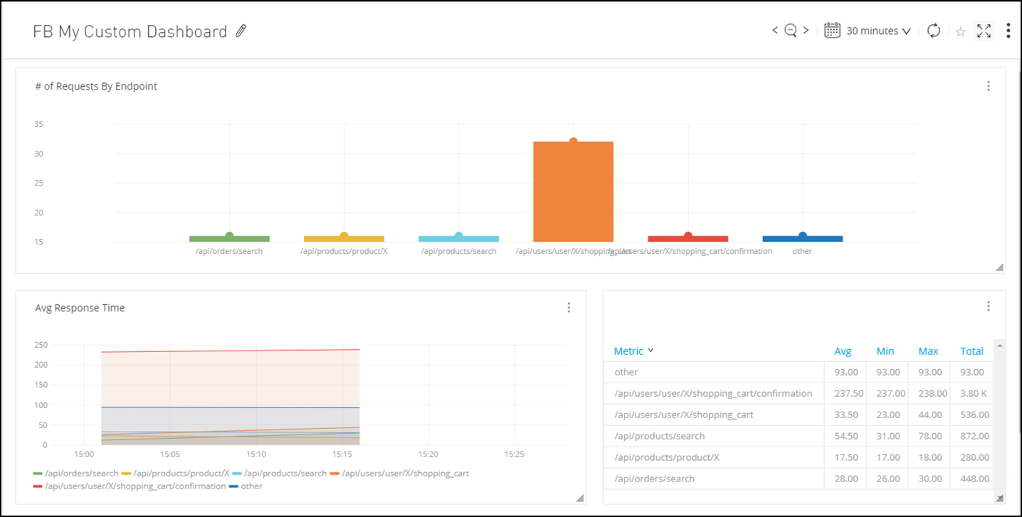
Step 3: Create a Request by Endpoint Graphic
In this step we are going to create a Bar Chart with the number of request grouped by Endpoint.
-
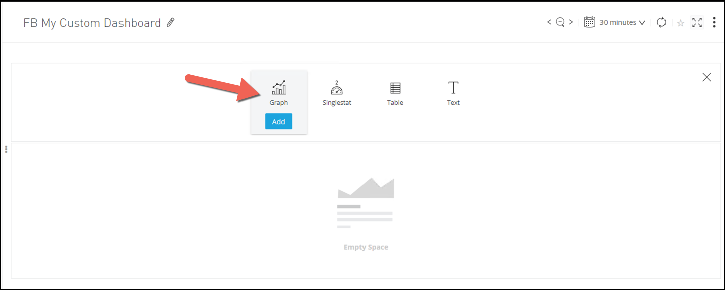
Press Add row button and then the Add Graph button.
-
Press the three dots on the right of the graphic and select Configure.
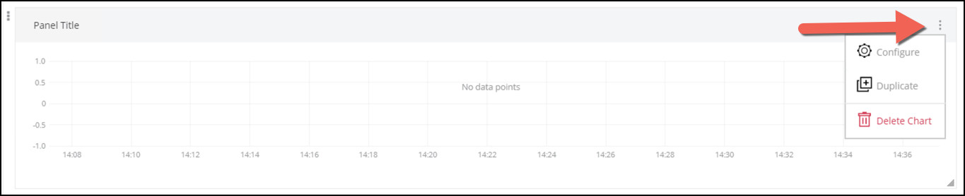
You will see a configuration panel.
-
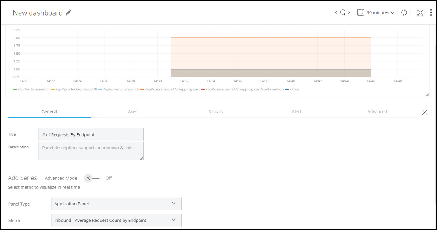
In the General tab complete with the following values:
Name Value Description Title
# of Request by EndpointTitle of the dashboard.
Panel Type
Application PanelYou can choose metrics between Runtime Manager and API Manager.
Metric
Inbound - Average Request Count by EndpointYou can choose between different metrics here.
Environment
SandboxEnvironment where the Mule Application is deployed
Resource
mon-omni-channel-api-<id>Mule Application that will provide the metrics.
After you enter those values, you will see the graphic display some metrics.
-
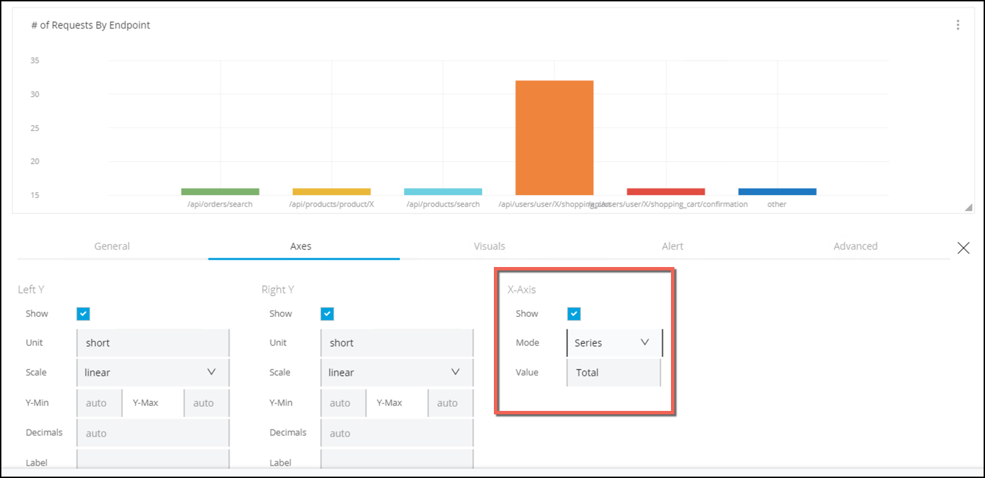
Go to the Axes tab
-
In the X-Axis Change the Mode to Series.
See how the graph changes.
-
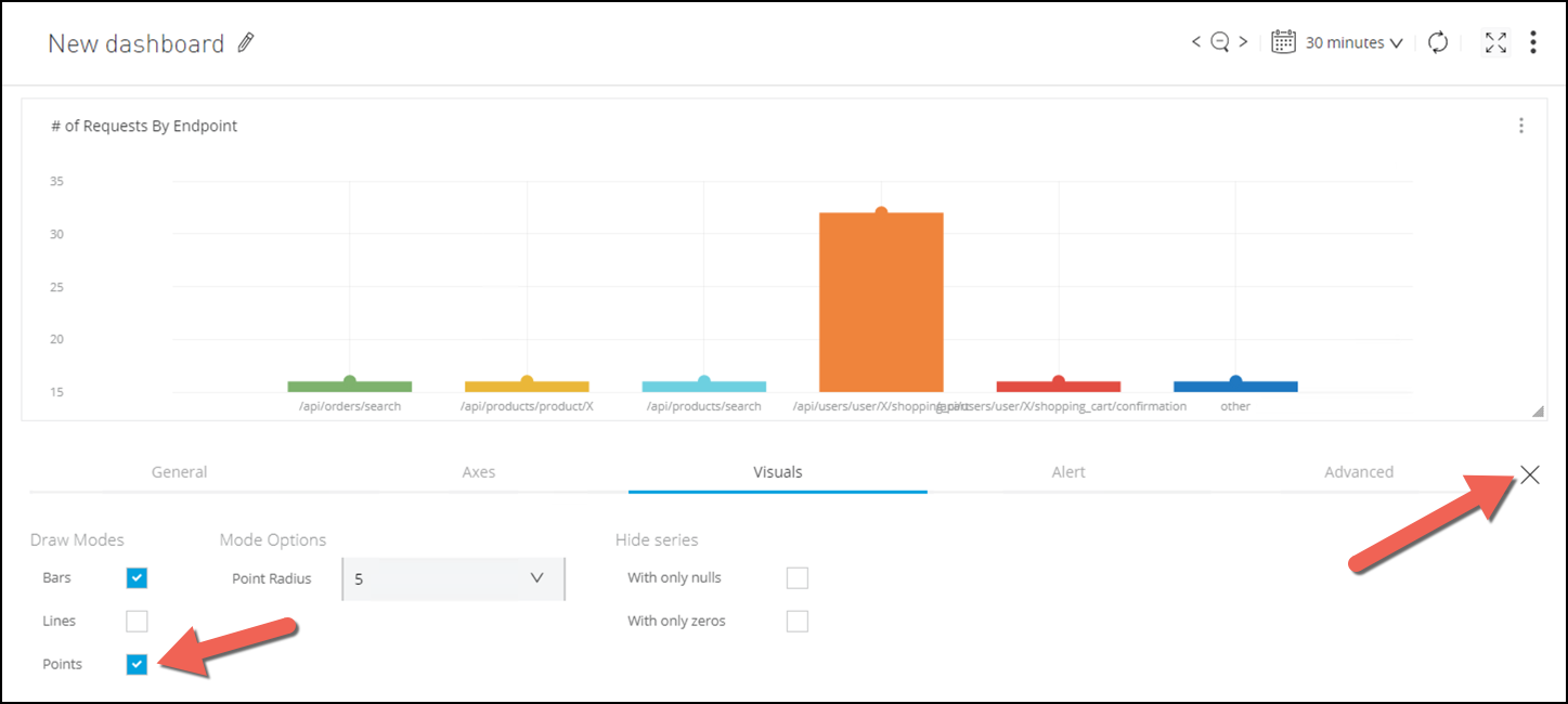
Go to the Visuals tab.
-
Select the Points Checkbox
-
Finally press the X that is on the right side of the panel.
-
Press Save Changes button.
-
In the Save As Pannel choose a representative name like
<initials> My Custom DashboardAt the end you should see somthing like this:
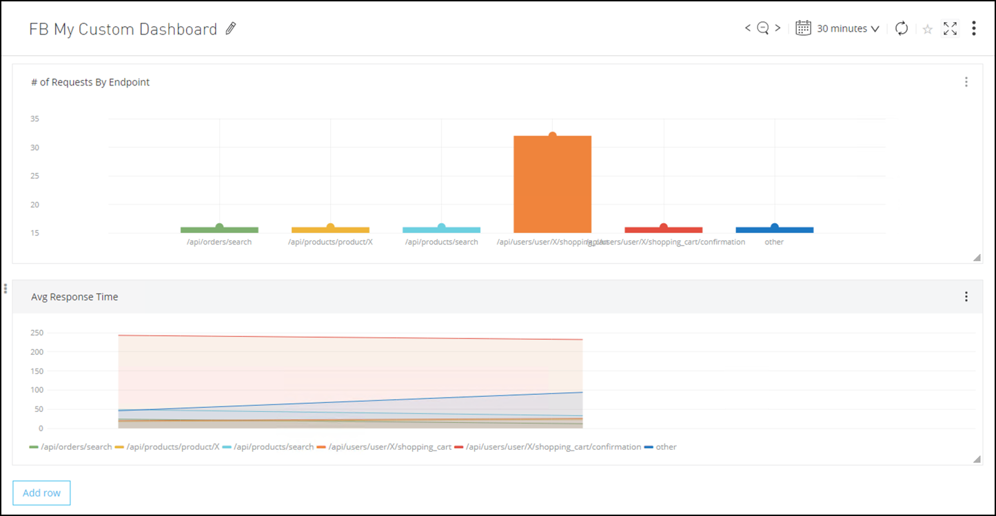
Step 4: Create Response Time Dashboard
Now we are going to add a new panel with information on the Response Time
-
Press the Add Row button.
-
Select the Graph icon.
-
Press the three dots on the right of the graphic and select Configure
-
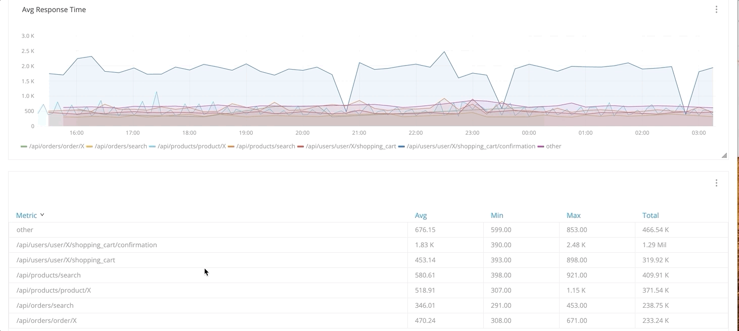
Complete with the following values:
Name Value Title
Avg Response TimePanel Type
Application PanelMetric
Inbound - Average Response Time by EndpointEnvironment
SandboxResource
mon-omni-channel-api-<id> -
Press the X to close the configuration panel.
-
Press Save Changes button.
You should see something like this:
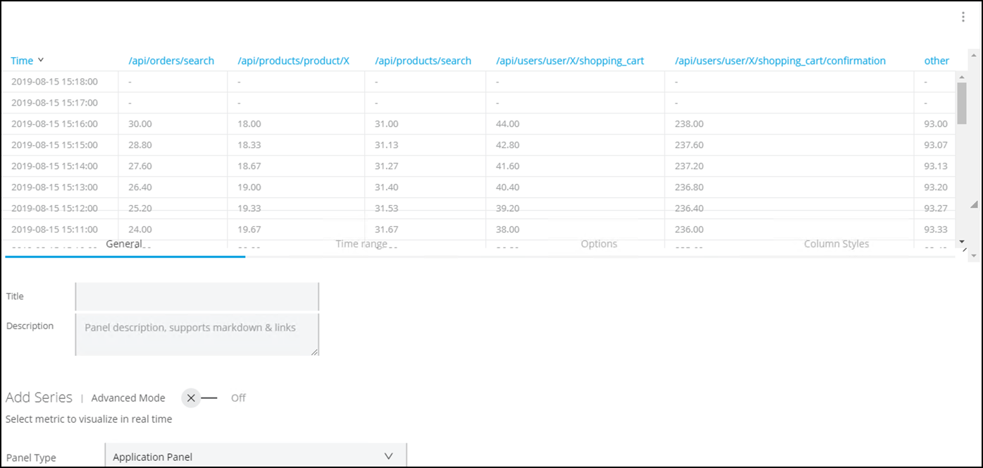
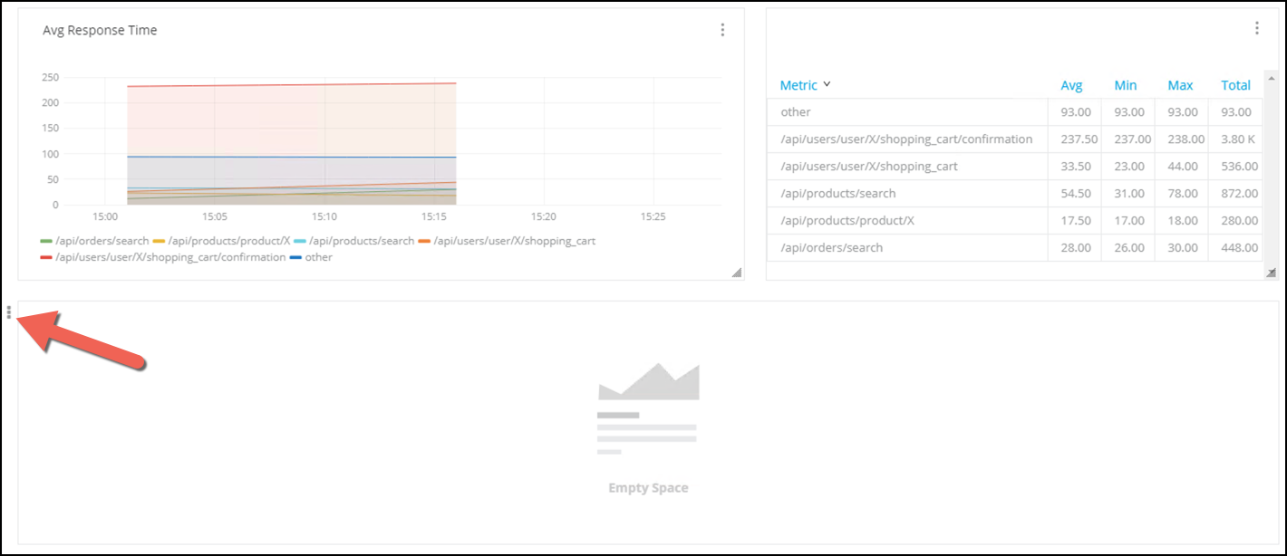
We want to see the response time numbers. For that we are going to add a table.
-
Press the Add row button.
-
Choose Table
-
Press the three dots on the right of the graphic and select Configure
-
Complete with the following values:
Name Value Title
Leave it Blank
Panel Type
Application PanelMetric
Inbound - Average Response Time by EndpointEnvironment
SandboxResource
mon-omni-channel-api-<id>Look at the table:
-
Go to the Options Panel
-
In the Data area.
-
Choose Time series to aggregate from the combo box.
-
In Columns, you will see Avg. Click the + button to add
Min,MaxandTotal.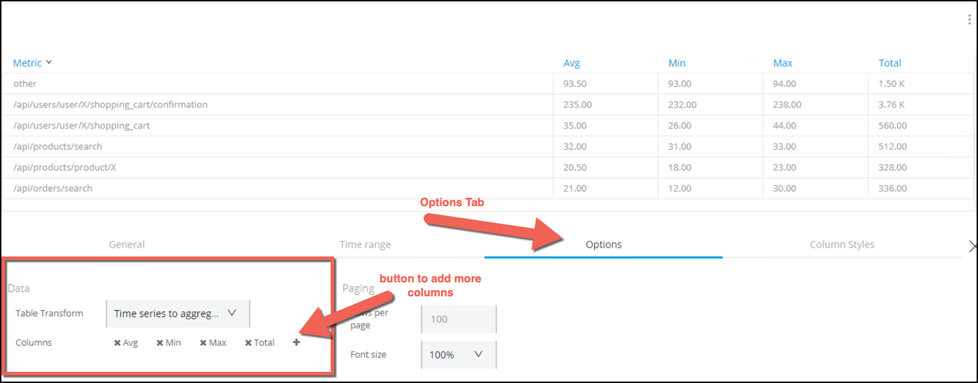
-
-
Press the X that is on the right side of the panel.
-
Press Save Changes button.
We are going to move the Table panel and place it in-line with the Avg Response Time panel.
The UI gives the ability to drag and drop panels and graphics.
-
Click to the right of the three dots associated with the row on the left side of the panel.
-
Drag and Drop the Table panel into the Graph panel.
You can use the right bottom corner of each panel to adjust it size before moving the panel. Since we moved the Table, you will see that there is an Empty Space section. Let’s remove that.
-
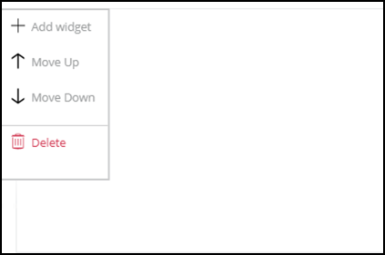
Move the pointer to the Empty Space panel. You will see three dots on the left side of the panel.
-
Point with the pointer to those dots. A new panel will appear.
-
Select Delete
At the end you should see something like this:
Step 5: Create Single Stats Graphics
In this section we are going to add single stat graphic for the System APIs. We would like to know if the avg response times of the system APIs are less than 10 seconds.
-
Press the Add row button.
-
Select Singlestat icon
-
Press the three dots on the right of the graphic and select Configure
-
Complete with the following values:
Name Value Title
Product API Avg Response TimePanel Type
Application PanelMetric
Inbound - Average Response Time by FlowEnvironment
SandboxResource
mon-product-api-<id> -
Go to the Options panel
-
In the Coloring column complete with:
-
Threshold:
4000,7000. This are the threshold values where the colors in the graphic will change. -
Colors: Press the invert button. The order of the colors should be red, orange, green.
-
-
In the Gauge check the Show box.
-
Change the Max value to
10000. Max Value means that a response time of 10000 ms or more will be unacceptable.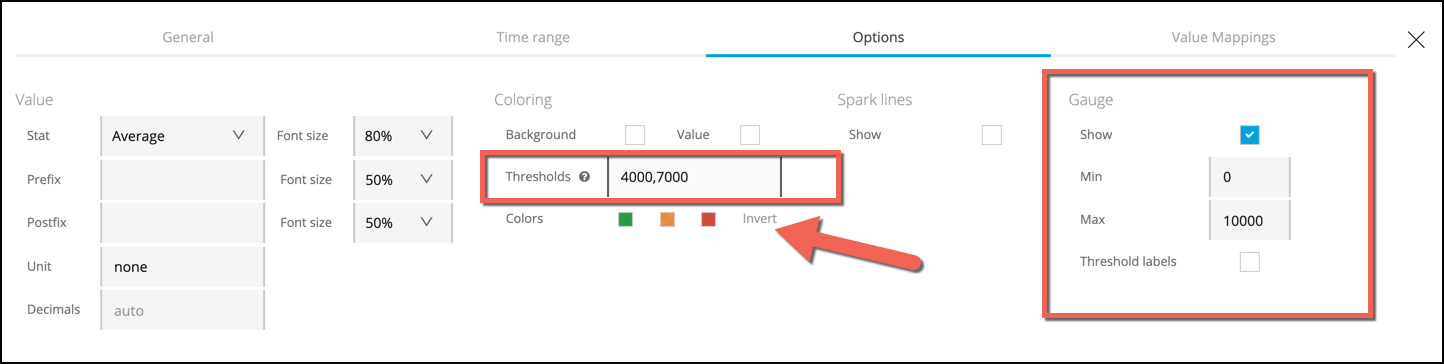
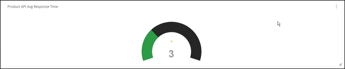
This graph will be green if the response time less than 4s, orange if it is between 4s and 7s and red if its over 7s.
-
-
Click the 'X' button to close the panel.
This is the final result
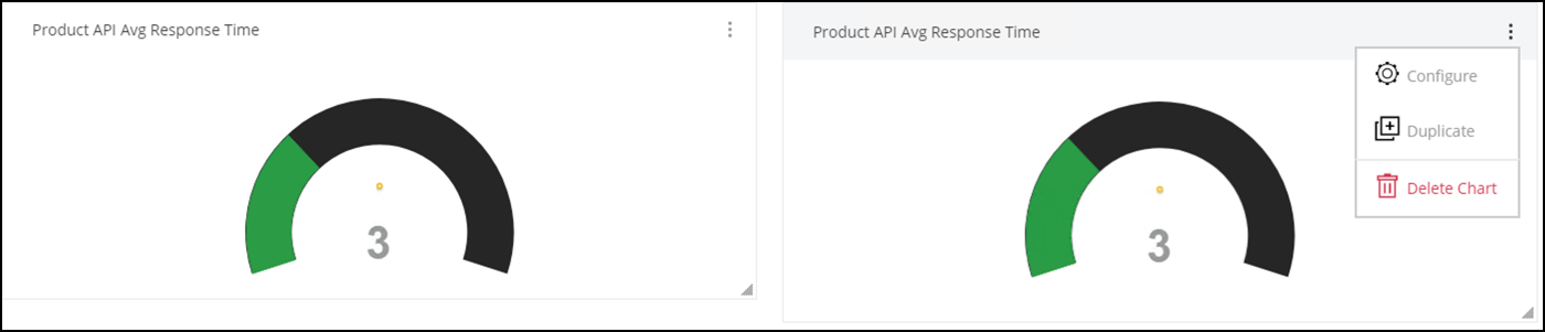
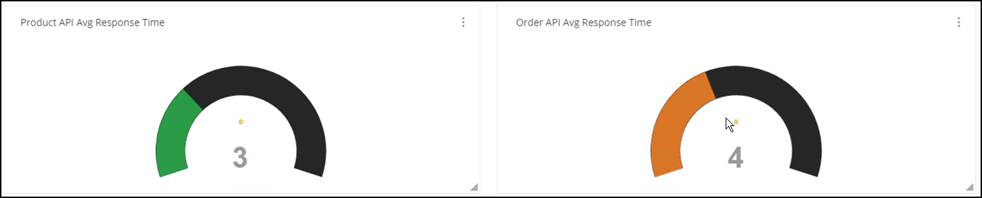
We will replicate the same graphic for the Order API and the Customer API.
-
Click on the three dots section for the Singlestat panel and choose Duplicate.
-
Go to the second panel and select Configure.
-
Change the Title to
Order API Avg Response Time -
Change the Resource field and select
mon-order-api-<id> -
Click the 'X' button to close the panel.
-
Press the Save Changes button.
We are going to repeat the last steps to Create the Customer API Panel.
-
Click on the three dots section fot the Singlestat panel and choose Duplicate.
-
Go to the third panel and select Configure.
-
Change the Title to
Customer API Avg Response Time -
Change the Resource field and select
mon-customer-api-<id> -
Click the 'X' button to close the panel.
-
Press the Save Changes button.
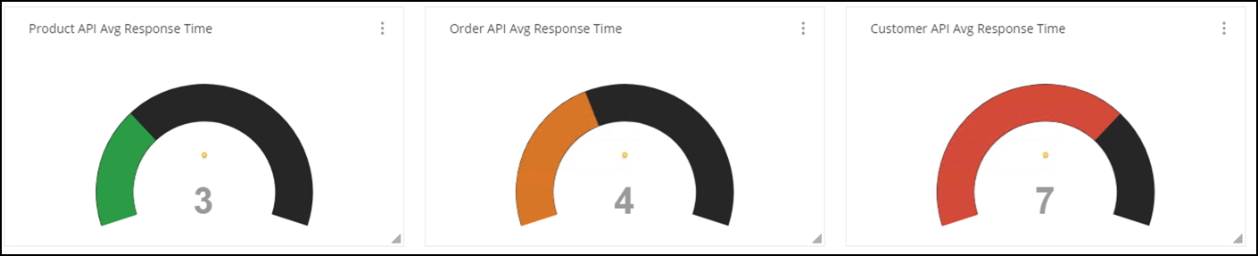
The complete dashboard should look like this:
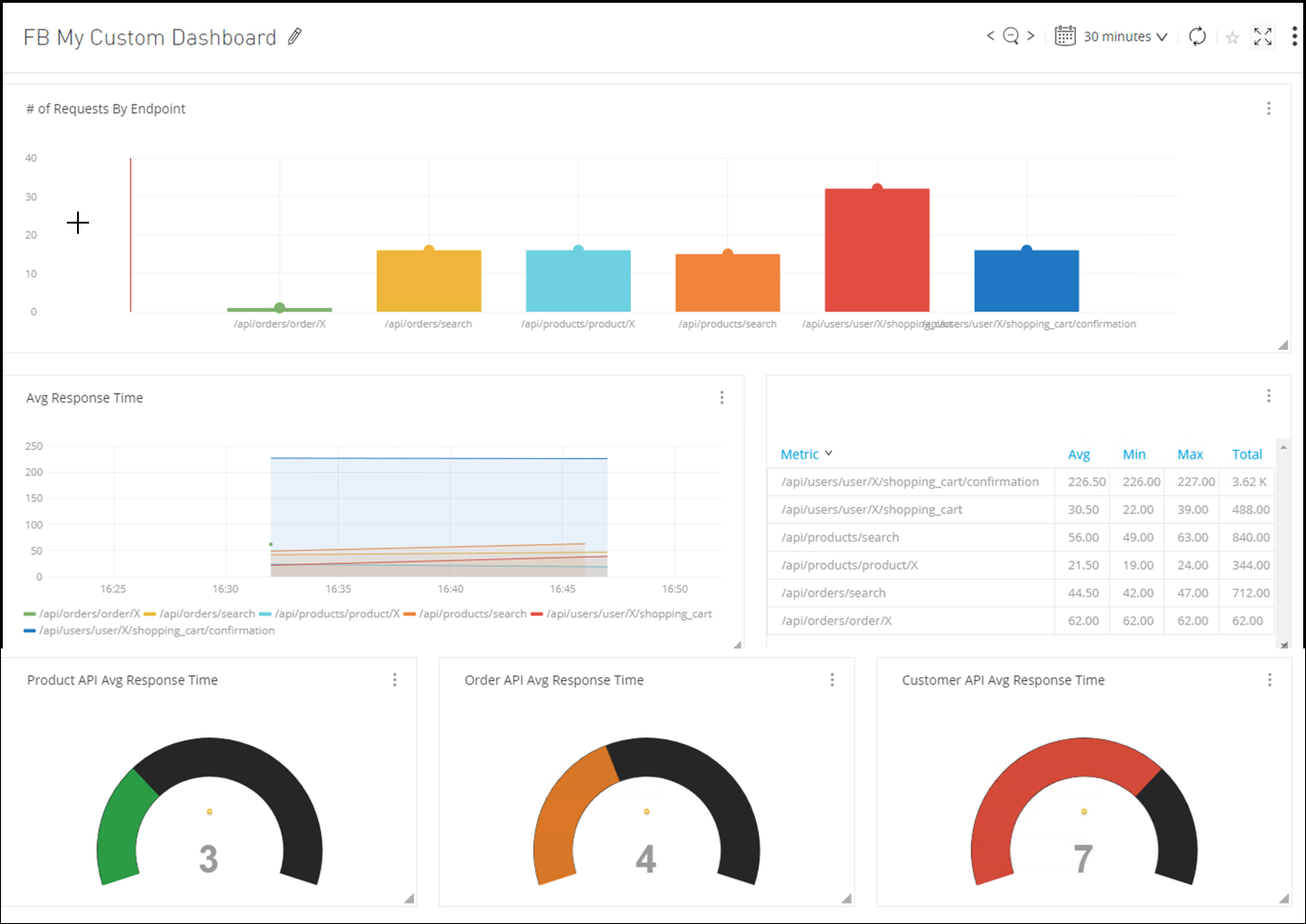
We would like to have the singlestat at the beginning, so let’s move the panel to the top.
-
Point to the left three dots of the last panel.
-
Select Move Up twice.
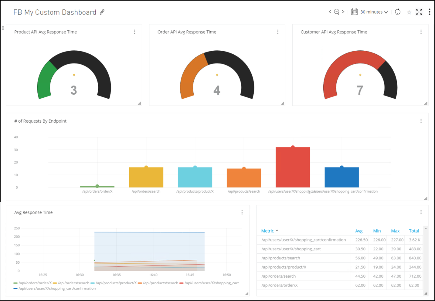
Now it looks perfect. You can save the changes.
Summary
In this lab, you completed the following steps:
Go Further:
-
See the Functional Monitor doc for more information.
-
See the Built-In Dashboards doc for more information.
-
See the Configure Custom Dashboards and Charts doc for more information.
-
See the Custom Metrics doc for more information.
Congratulations! You have completed Lab 2
Please proceed to Lab3